Pinpoint – A Lost & Found Tool Built for Campus
Pinpoint is a student-led lost-and-found app designed to help UC Davis students quickly locate and reclaim lost items through a centralized, searchable, and trustworthy platform.

My role:
UX Designer (research synthesis + lost item flows + visual direction)
Team
1 co-designer, 1 PM, team of student developers
Timeline
~7 months (Fall 2024 – Spring 2025)
Tools
Figma, Notion, interviews, surveys
[IMPACT SUMMARY]
Designed the lost item discovery and search experience (home page, filtering, settings), grounding each interaction in validated user needs like trust and item categorization.
Created the landing page visual direction and messaging that established Pinpoint's brand identity (from harsh red to calming blue + compassionate tone) and influenced all downstream design decisions.
Iterated on search and settings flows based on user feedback from a structured testing session, simplifying categorization and reducing cognitive load for students searching for lost items.

[OVERVIEW & CONTEXT]
What is Pinpoint?
A campus-wide lost-and-found platform connecting students who've lost items with those who've found them. Unlike scattered solutions (Facebook groups, physical front desk logs, word-of-mouth), Pinpoint centralizes the experience in one searchable, categorized, and trust-enabled space.
Why it matters:
Students have no centralized way to search for lost items. Current solutions are scattered across platforms, lack verification mechanisms, and often result in items never being recovered.
74%
of students have lost item(s) on campus
89%
of students have found a lost belonging on campus
78%
Of students were unaware of currently offered lost and found services
My contribution:
As the UX designer leading research synthesis and the lost item user flow, I was responsible for:
Synthesizing 30+ qualitative interviews into actionable insights and user behaviors
Designing the home page, search/filtering experience, and settings flows for users searching for lost items
Establishing the visual direction and brand messaging (landing page) that shaped the product's entire design language
Iterating on flows based on user feedback and advisor guidance
[My co-designer led the found item (submission) flow and visual refinement; our PM managed roadmap prioritization; the dev team brought everything to life.]
Constraints & scope:
Student-led team with limited dev resources → focus on MVP lost + found flows, defer advanced features (in-app messaging, trusted friends network)
12-week timeline across 3 quarters → design had to adapt as team capacity shifted (loss of one teammate after the first quarter, marketing/graphics in later phase)
Campus-specific context → solution needed to work for UC Davis culture and operational constraints
Success looked like:
A streamlined experience where students could quickly report a lost item, search using filters that matter (category, location, value), and contact finders with confidence.
[RESEARCH → INSIGHTS → FEATURES]
Research approach:
I led the synthesis of qualitative research conducted across three phases:
Phase 1: Qualitative interviews (30+ conversations)
Explored what students do when they lose something, how they search, and whether they've successfully recovered items
Focused on practical behaviors rather than emotions (emotional design came later)
Phase 2: Survey validation (broader sample)
Tested early assumptions about item value, false claims, and return preferences
Key finding: 55.6% of users preferred direct contact with item owners (→ shaped our contact-info feature)
Revealed areas we over-focused on (monetary value concerns) vs. what we should've validated (anonymity, ownership verification sensitivities)
Phase 3: Competitive & comparative analysis
Reviewed UC Davis's existing lost-and-found systems, Facebook groups, Ring Neighbors, Pixit, Crowdfind
Identified patterns: decentralized platforms lacked filtering; structured tools lacked user adoption; Japan's system relied on cultural norms we couldn't replicate
[IDEATION & THE 'LOST' FLOW]
Design exploration:
Starting in Fall 2024, I sketched out how a student would report and search for a lost item. Early explorations included:
A landing page toggle between "lost" and "found" routes (later removed when we realized it cluttered the dashboard)
A dashboard housing both past reports and recent matches
A multi-step report flow balancing thoroughness with cognitive load
Key design decision: Categorization
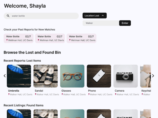
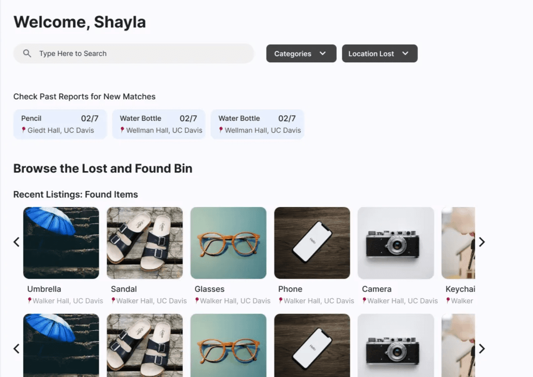
One challenge was deciding how to structure item descriptions without overwhelming users. We deep-dived into UC Davis's existing lost-and-found process, which had 3–5 substeps depending on item type. Inspired by this, my co-designer shortened our report flow and made category selection dynamic: once a user picks "clothing," they see relevant subcategories (jacket, shoes, etc.) and fields (size, color, brand). This kept the form scannable while gathering necessary details. Due to technical constraints, our team found the best option was to use filter bubbles with text.
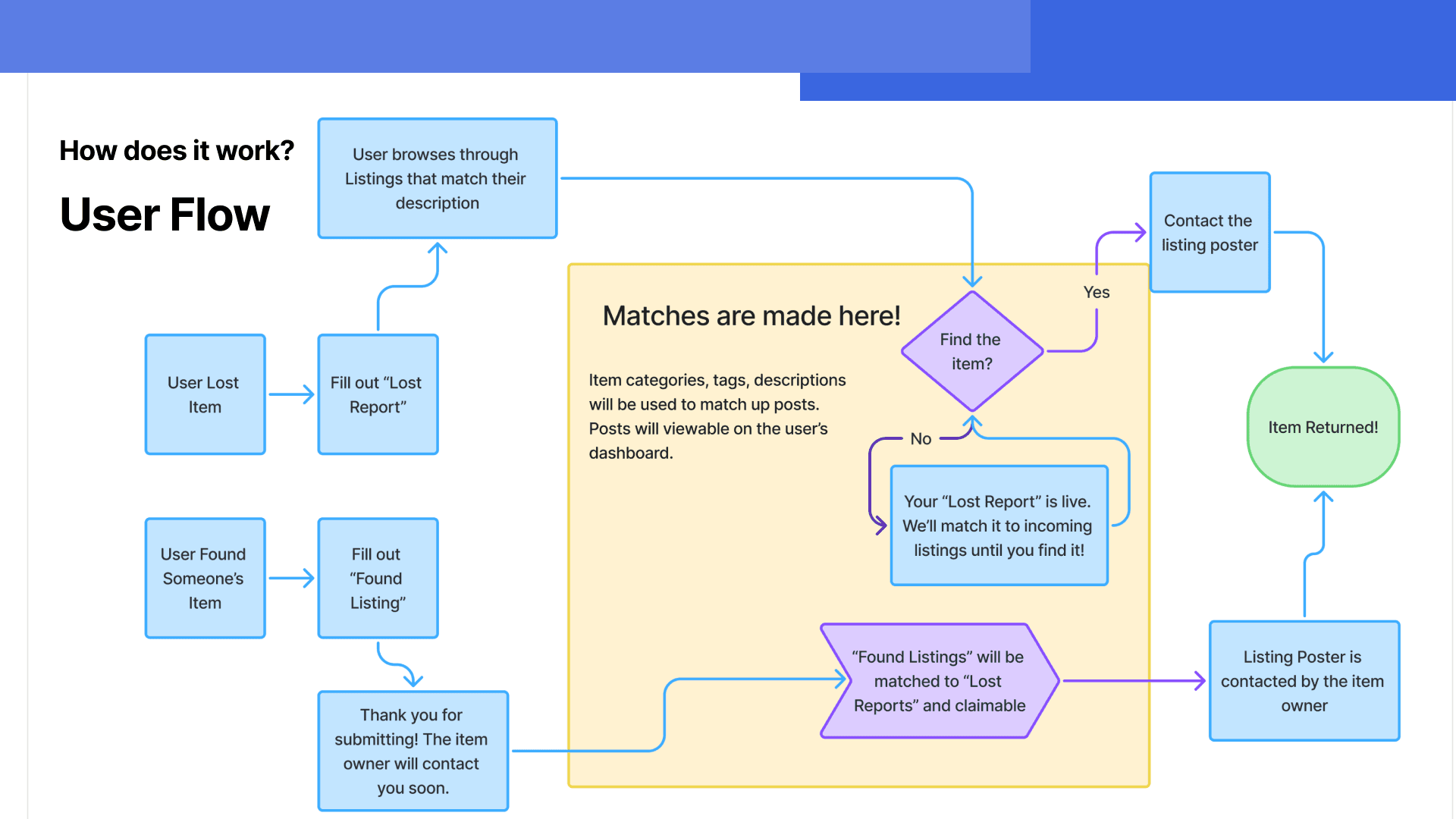
Keeping the team aligned as designs evolved: With each quarter came new iterations—routes were removed, dashboard layouts were reorganized, and categorization logic shifted. By mid-Winter, the team needed a single source of truth for how a student's lost-item journey unfolded. I created a comprehensive user flow diagram mapping every step from app entry through item claim, which became our north star for both design and development. This artifact clarified decision points (e.g., "Does the filter happen on the home page or in the report flow?") and prevented rework down the line.
[USER TESTING & ITERATION]
Testing approach:
In Spring 2025, I presented our work to our staff advisor for feedback on visual direction and interaction design. Rather than a formal usability test, this was a design critique that revealed three critical insights
What we tested:
Search and settings flows (how students filter and refine results)
Landing page messaging and visual tone
Categorization and field complexity in the report flow
Key feedback & changes:
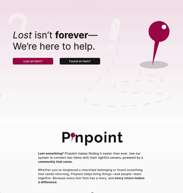
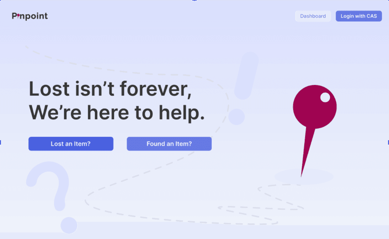
Harsh visual tone → Calming brand
Finding: The initial red-dominant palette felt urgent or harsh, not trustworthy or welcoming.
Change: Introduced blue as a complementary color to soften the design. This shift rippled across all screens and messaging, reinforcing a calmer, more compassionate tone.
Categorization complexity
Finding: The multi-step report flow was clear but users wanted faster "quick report" paths.
Change: Streamlined substeps and made category selection dynamic (e.g., showing "jacket" options only if "clothing" is selected), reducing cognitive load.
Landing page clarity
Finding: The original landing page didn't clearly signal what Pinpoint does or who it's for.
Change: Rewrote messaging to emphasize community, trust, and the emotional payoff ("Because every lost item has a story, and every return makes a difference"), then designed visuals to support that tone.
[OUTCOMES & KEY LEARNINGS]
What shipped:
A fully designed lost item flow (report, search, dashboard, settings) informed by 30+ interviews and validated design decisions
A visual system and brand direction (landing page messaging + red/blue palette) that established trust and warmth
Documentation linking each feature to its research origin, helping future contributors understand why choices were made
For future iterations:
Trusted-friends network (deferred for MVP but researched and designed)
In-app messaging between finders and seekers (validated as a need, but deprioritized given dev capacity)
Full mobile implementation (hi-fi designs complete, but not coded)
What I'd do differently next time:
Test with actual users earlier and more frequently. Our feedback session was valuable but came partway through. More lightweight user testing (even 3–5 students) throughout the process would've caught assumptions sooner.
Early concept testing is essential for team alignment. Early validation with students (not just the design team) could've prevented some of the circular discussions around lost vs. found routing and helped us commit to key mental models faster.
Be clearer about what "finding a lost item" feels like emotionally. We focused on practical behaviors (what do you do?) rather than emotional states (how do you feel?). A future round of testing should explore whether our design actually makes users feel relieved, hopeful, or part of a community.
What this taught me as a designer:
~~Research isn't just input; it's justification. By tracing every feature back to an interview insight or survey response, I learned how to make design decisions defensible and stakeholder-friendly.~~
Visual direction is strategic. The landing page and color palette weren't "nice extras"—they set the tone for how users perceive the product's trustworthiness. I gained deeper respect for the role of branding in UX.
Simplicity emerges from constraints, not from avoiding complexity. The deferral of advanced features (messaging, trusted friends) forced us to define a tight MVP, which actually made the core experience clearer and more usable.